Methodology
The decisions worth arguing about
The scoring index is a 0–100 composite of five components — clean electricity level, five-year
momentum, carbon intensity, fossil dependence and energy productivity. The interesting part is
not the formula. It is the handful of decisions that stop the formula lying to you.
Missing is not zero
A country needs at least three of the five components to be scored at all. Fewer, and it
returns Insufficient Data — a status, not a low score. Treating a gap as a zero
quietly punishes countries for their statistics office rather than their power sector.
Shares are recomputed, never averaged
Renewable share is SUM(renewable TWh) / SUM(total TWh). Averaging a percentage
across countries or across years weights a country generating 4 TWh the same as one generating
400. This is the single most common way an energy dashboard becomes confidently wrong.
Outliers are capped before normalising
Energy productivity is capped at the 95th percentile before the scale is built, so one
unusual economy cannot compress everyone else into the bottom third of the range.
Micro-states are scored but not ranked
Below 1 TWh of annual generation, a single new installation moves the score more than a
decade of policy. They still get a score; they are excluded from the league table.
Weights are a business decision, not a constant in the code
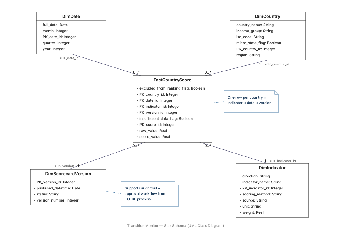
They live in a versioned decision log and in the indicator dimension. When Research changes
a weight, the change has an owner, a date and a reason — and every scorecard built under the
old weights stays reproducible.
Scorecard lifecycle
Modelled as a UML state machine, because the rules are easier to argue about as states than as prose.
Draft→
In Review→
Approved→
Published→
Superseded
↩ From In Review a reviewer can send it to
Changes Requested, which returns to In Review once the analyst responds — a loop,
not a dead end.
A scorecard may only be published from Approved. When a new data vintage lands, the
previously published scorecard becomes Superseded — never deleted. That one rule is what
makes an old published number defensible a year later.