Business Analysis BPMN 2.0 & UML Enterprise Architect Agile Delivery

Transition Monitor — turning a 15-day manual scorecard into a governed process

A full business analysis showcase: the AS-IS pain mapped honestly, a TO-BE process designed around a human review gate, a data model that makes every published number traceable, and wireframes that carry their requirement IDs on the page.

A portfolio project, and I'll say so plainly. Terrawatt Advisory is a fictional client. The energy data is real — Our World in Data, CC-BY, 220 countries and 7,696 country-years. This demonstrates method, not employment history. Everything shown below I built.
<1 day
Scorecard cycle time, down from 15 — review gate kept
5 pools
TO-BE process, with exception paths
130 cols
Source data, ~36% sparse in places
5 epics
~22 stories, two sprints, in Jira

The method lived in one analyst's head.

Terrawatt's analysts produce a Country Transition Scorecard on request — how fast is this country's electricity system actually decarbonising, and who is stalling. The output mattered. The process producing it did not survive contact with a second analyst.

What actually happened

  • An analyst downloaded open energy data into Excel and hand-cleaned it — units, missing years, country name variants
  • They applied a scoring method that existed only in one senior analyst's head
  • They emailed the workbook to a reviewer, who emailed comments back
  • Roughly 15 working days per country, with no audit trail
  • Two analysts scoring the same country produced different answers
  • When the source published an update, every scorecard silently went stale

What that costs

  • Key-person risk: the methodology is undocumented and unversioned
  • No defensible answer to "why is this country scored 62?"
  • Review by email means no record of what changed, or why
  • Published numbers quietly diverge from the data behind them
  • The bottleneck is a person, so the service cannot scale

Before and after, in BPMN 2.0

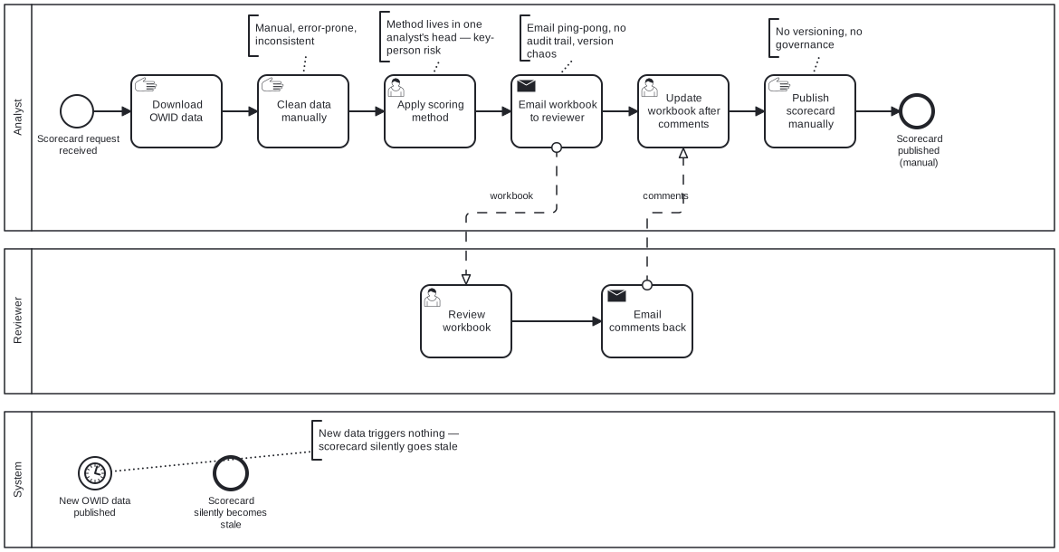
Both diagrams are modelled in Enterprise Architect using the same conventions, so they are directly comparable. Flip between them: the analyst lane empties out, the system lane fills up, and the review gate survives the redesign on purpose.

BPMN collaboration diagram of the Transition Monitor scorecard process
AS-IS — the manual process. Every annotation is a real failure mode: “method lives in one analyst's head — key-person risk”, “email ping-pong, no audit trail”, and a System lane whose only job is to let scorecards go stale.

Click a diagram to open it full size.

What the redesign changes

  • A new data release triggers the cycle, instead of triggering nothing
  • Validation runs before scoring, and quarantines what fails rather than silently dropping it
  • One scoring engine, so two analysts get the same answer
  • Every scorecard is versioned with an audit trail as it is created
  • Review happens in the system — no email ping-pong, no lost comments

What the redesign deliberately keeps

  • The human review gate. Automation makes the draft; a person still approves it
  • The analyst's ability to comment and adjust before submitting
  • A change-requested path back to the analyst, rather than a hard reject
  • Publication as an explicit act, not a side effect of a successful run

Why every published number can be traced back

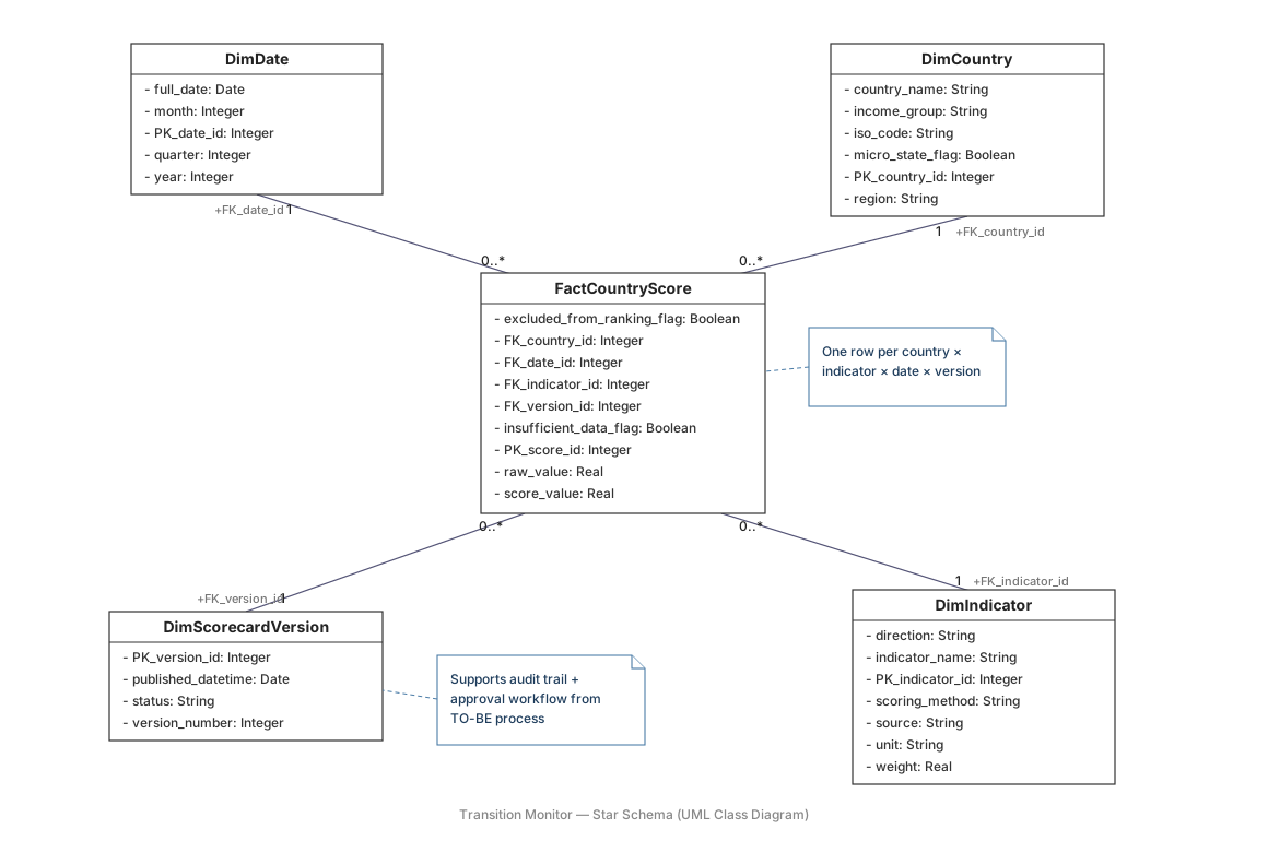
A star schema in UML: one fact, four dimensions. The parts that matter for governance are the flags and the version dimension — they are what let the process above make promises it can keep.

UML class diagram of the Transition Monitor star schema: FactCountryScore with DimDate, DimCountry, DimIndicator and DimScorecardVersion
FactCountryScore is grained one row per country × indicator × date × version. DimScorecardVersion carries status and version number, which is what makes the approval workflow and the audit trail possible. DimIndicator holds each component's weight, direction and scoring method as data — so changing a weight is a business decision with a record, not a code change.

Click to open it full size.

The wireframe carries its requirement IDs

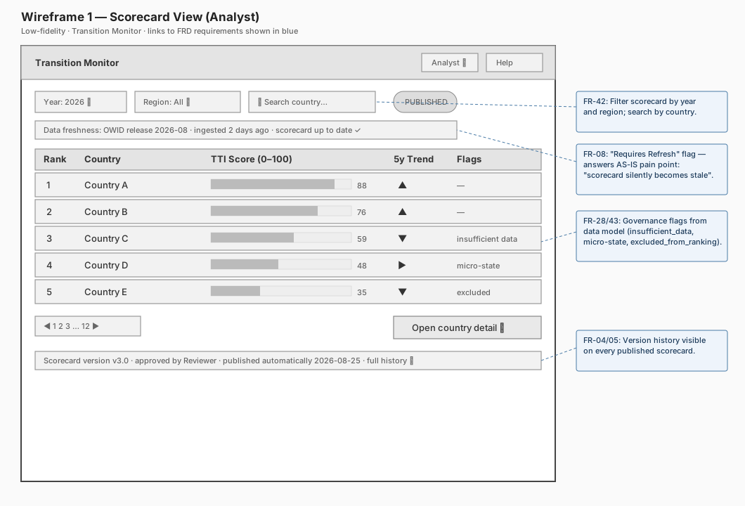
A low-fidelity screen is only useful if you can say which requirement each element satisfies. Every callout here points back to a numbered functional requirement — which is also how the traceability runs the other way, from requirement to design to test.

Low-fidelity wireframe of the Transition Monitor scorecard view, annotated with functional requirement references
Scorecard view (Analyst). FR-42 filtering and search · FR-08 the “requires refresh” flag, answering the AS-IS pain point where a scorecard silently goes stale · FR-28/43 governance flags carried straight from the data model · FR-04/05 version history visible on every published scorecard.

Click to open it full size.

The decisions worth arguing about

The scoring index is a 0–100 composite of five components — clean electricity level, five-year momentum, carbon intensity, fossil dependence and energy productivity. The interesting part is not the formula. It is the handful of decisions that stop the formula lying to you.

Missing is not zero

A country needs at least three of the five components to be scored at all. Fewer, and it returns Insufficient Data — a status, not a low score. Treating a gap as a zero quietly punishes countries for their statistics office rather than their power sector.

Shares are recomputed, never averaged

Renewable share is SUM(renewable TWh) / SUM(total TWh). Averaging a percentage across countries or across years weights a country generating 4 TWh the same as one generating 400. This is the single most common way an energy dashboard becomes confidently wrong.

Outliers are capped before normalising

Energy productivity is capped at the 95th percentile before the scale is built, so one unusual economy cannot compress everyone else into the bottom third of the range.

Micro-states are scored but not ranked

Below 1 TWh of annual generation, a single new installation moves the score more than a decade of policy. They still get a score; they are excluded from the league table.

Weights are a business decision, not a constant in the code

They live in a versioned decision log and in the indicator dimension. When Research changes a weight, the change has an owner, a date and a reason — and every scorecard built under the old weights stays reproducible.

Scorecard lifecycle

Modelled as a UML state machine, because the rules are easier to argue about as states than as prose.

Draft In Review Approved Published Superseded

From In Review a reviewer can send it to Changes Requested, which returns to In Review once the analyst responds — a loop, not a dead end.

A scorecard may only be published from Approved. When a new data vintage lands, the previously published scorecard becomes Superseded — never deleted. That one rule is what makes an old published number defensible a year later.
Success criteria I'd hold myself to

Delivery

  • Scorecard cycle time from 15 working days to under one, with the human review gate kept
  • One governed methodology — two analysts, same country, same score

Governance

  • Every published number traceable to a source column and a data vintage
  • Every requirement traceable to a process activity, a backlog story and a test
BPMN 2.0 UML Enterprise Architect Requirements & traceability Star schema Jira Confluence Python Power BI

Recognise this process?

Most teams have one. A number everyone relies on, produced by a method nobody has written down, by a person who really ought to be allowed a holiday. That is the work I do.